Medical Device CMS
UX Case Study #2
PROJECT TIMEFRAME: March 2021
CONTENTS:
- Overview
- Problem Statement
- Users and Audience
- Team Roles
- Scope and Constraints
- Process
- Outcomes and Lessons
1. OVERVIEW
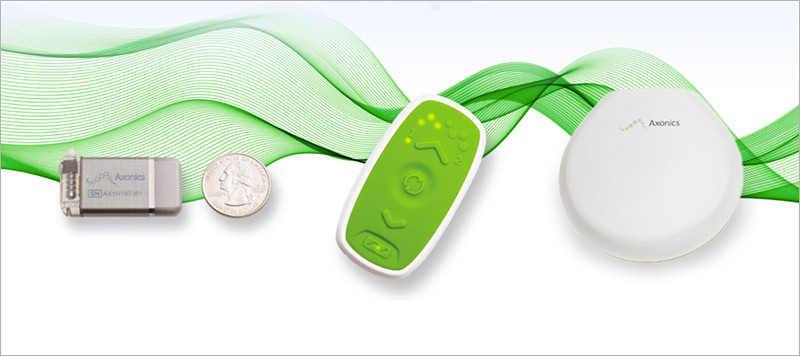
JS Medical, a entrepreneurial team specializing in development of software solutions for medical devices had pitched a proof of concept and needed a prototype design for further project funding.
2. PROBLEM STATEMENT
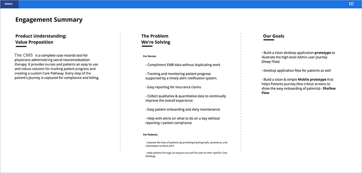
Our demo needed to sucessfully illustrate how the CMS tool would support Nurse/Admins and Patients in successfully completing the device trial run.
The team had 2 weeks to
- Produce a prototype which would entice investors to greenlight a MVP
- Understand the problem space
- Define the products value proposition
- Familiarize ourselves with the nurse and patient journey.
- Identify an ideal experience and outcomes for both nurse/admins and patients.
- Identify and support the critical tasks throughout the user journey.
The full product suite consisted of a nurse/admin portal CRM tool and a patient facing app not covered in this case study.
The tool we developed was primarily in support of that initial trial run journey for nurse-admins and patients. These were the primary personas for which two unique solutions were generated. We'll be focused on the nurse-admin solution which I designed while another UI/UX designer focused on the patient facing solution.
3. USERS AND AUDIENCE
Nurses - also referred to as nurse/admins.
Doctors - Recommended the device for trial run or permanent. May or may not perform the actual procedure itself.
4. TEAM ROLES
An agile team constructed specifically to have enough bandwidth to complete the assignment in the agreed timeframe consisted of:
- UI/UX Designers: I was dedicated to producing the Nurse experience, our other designer on Patients.
- Project Manager: Roadmap, business rules, scope, success criteria.
- Subject Matter Experts: Representing client, nurses, doctors, billing companies.
5. SCOPE AND CONSTRAINTS
Constraints included a 2 week time box to produce an MVP in the format of a clickable prototype. We were aware that there would not be enough time to perform concept testing on the MVP and accepted that some design decisions would be necessarily based on interviews with SME's, and educated guesses. This would prove significant in the later phases of defining the patient solution. Finally, to ensure on-time delivery we would utilize an existing design system as much as possible.
6. PROCESS
At the onset, we needed to achieve a level of familiarization with the nurse/admin journey as well as the device itself. A detailed understanding of the user journey was captured through a "0 Sprint" approach which consisted of client interviews, SME input, competitive analysis, industry research, and rapid iteration based on client feedback.
Once objectives and scope were defined we would move on quickly to the specific steps which would help in developing the desired outcome.
The next step was to understand both the nurse/admin journey compressing the data points into workflows. Our timeframe required a high tolerance of assumptions regarding acceptance of features that may overlap with existing workflows. Early in Sprint 0 we conducted a series interviews with our client. As a medical practitioner and producer of previous device solutions, our client had a high level of familiarity with the product development process and served as our primary subject matter expert.
We performed approximately 3 days of discovery leaving seven days to focus on designing our prototype. During the first week, we had several progress meetings where we refined the objectives of the initial discovery step and extended our understanding of specific project challenges.
We quickly developed formal personas for Nurse/Admins and patients then moved on to defining their user journeys. During these first few days we also acquired a baseline understanding of the broader medical space as well as the role which the CMS tool would play in supporting the process. By the end of the second client meeting, I had collected enough information to begin ideating relying on low fidelity sketches for buy in. At the beginning of the second week we made a number of adustments to our design assumptions based on interviewing physicians directly familiar with the procedure. Because we’d familiarized ourselves with the space under which the device and product fell, these conversations became increasingly detailed in regards to the experience of nurses and concerned third parties. Through these additional interviews, combined with a brief dip into detailed task analysis, we were able to produce a core workflow.
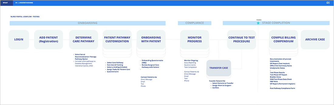
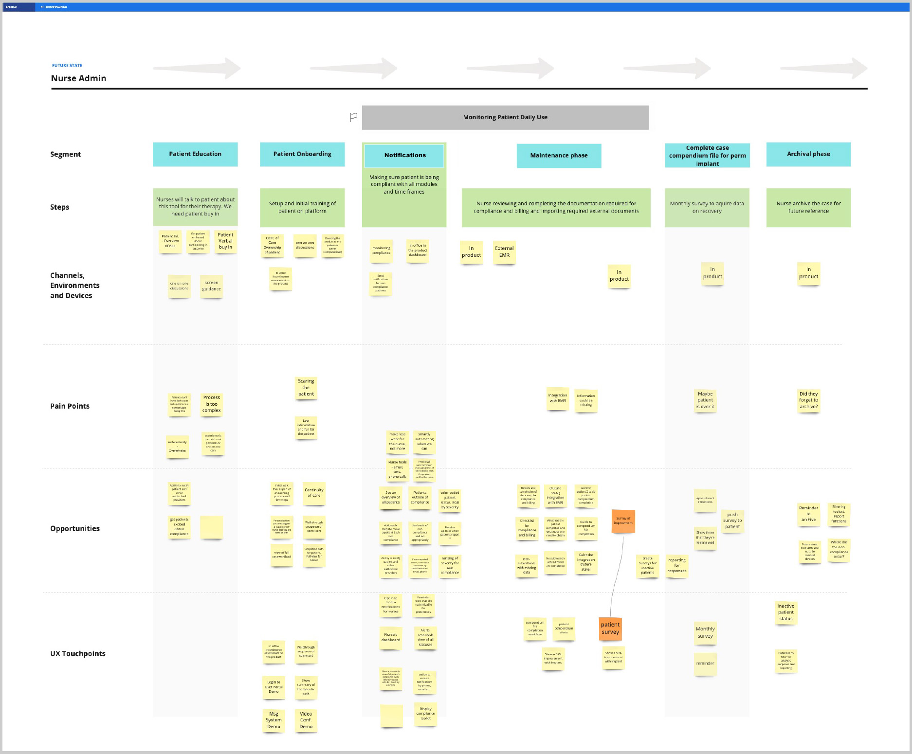
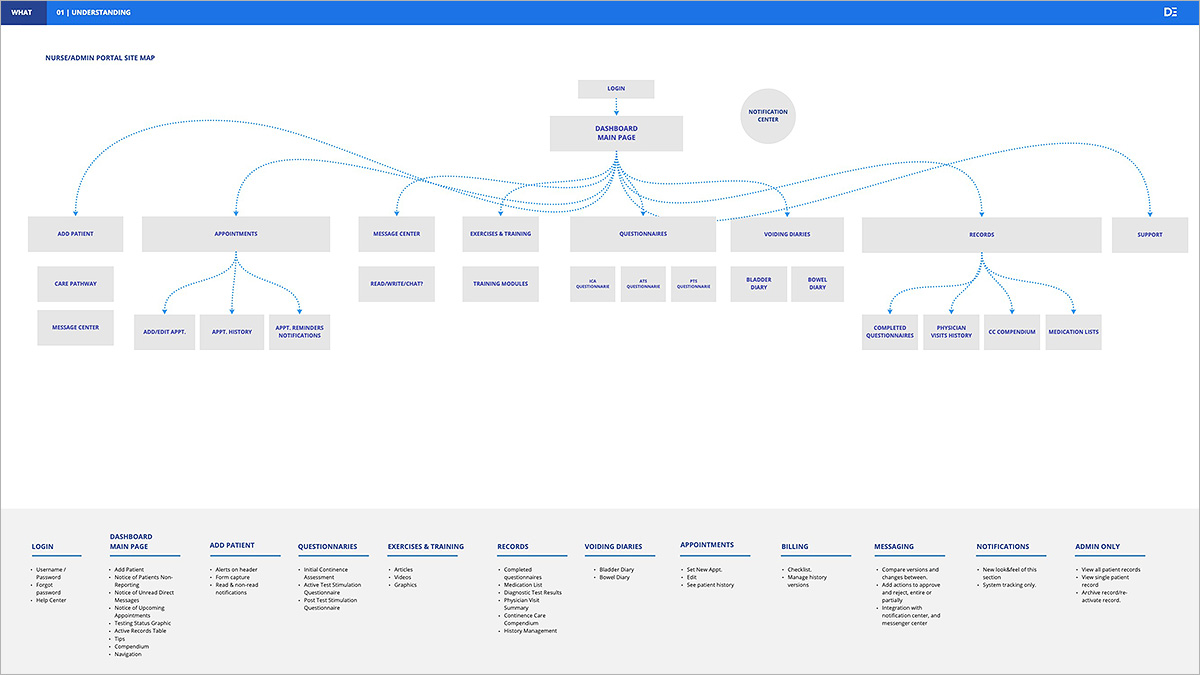
The basic information architecture of the site was fairly straightforward. I identified top-level categories which provided access to specific data points in the user journey and from them defined our top-level categories. Later interviews would challenge that structure and we reclassified some top-level items based on an overarching classification as well as their relationship to one another. An example of this is the sections for Exercises & Training, Questionnaires, and Voiding Diaries would all fall under the top category of Patient Records.
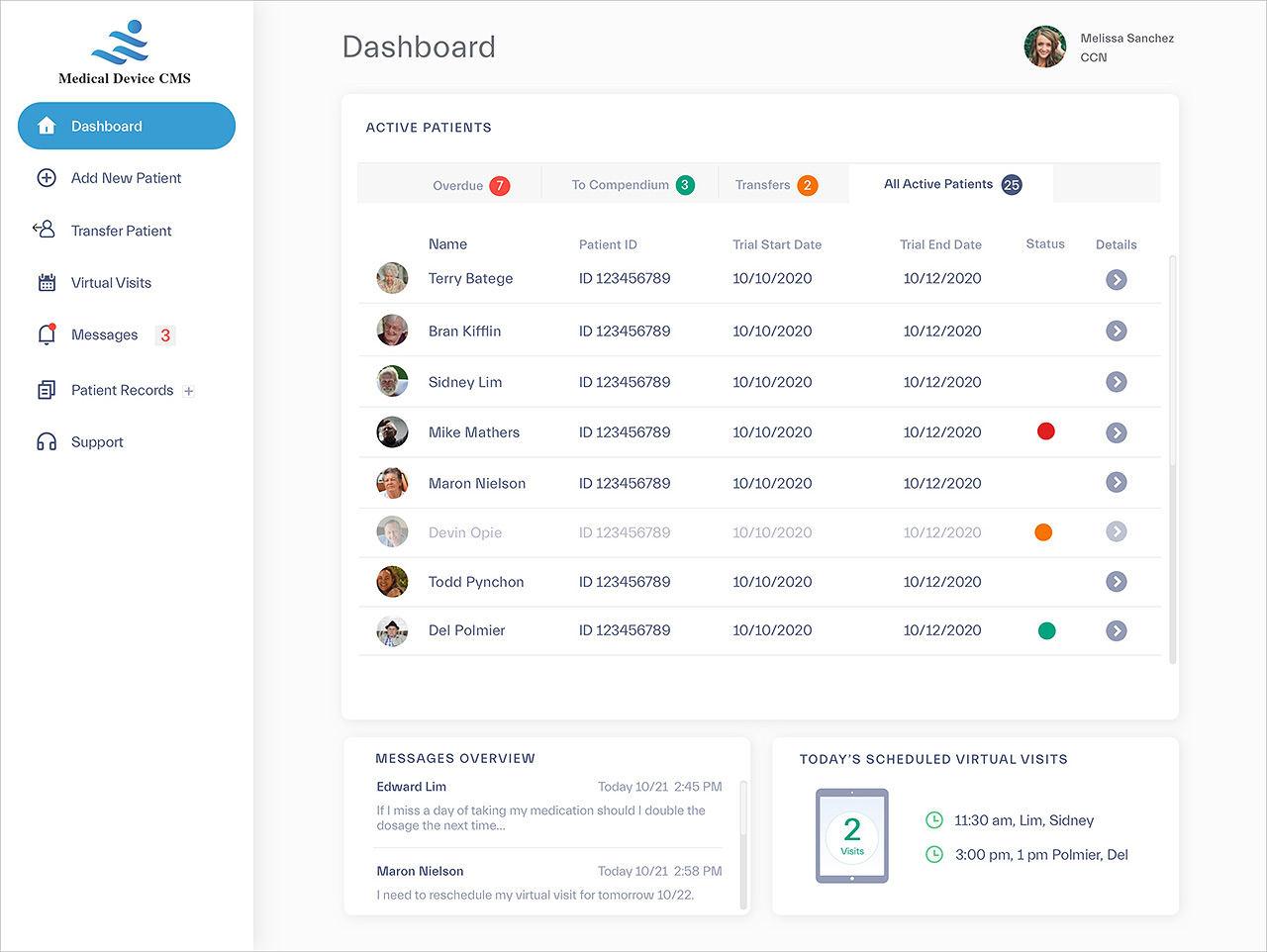
Late in the first week I began producing high fidelity wireframes utilizing DePalma's design system.
INSIGHTS AND REFINEMENTS
Our original workflow did not account for patients which might transfer from doctors who did not perform surgery. For example, an OB Gyn would refer their patient for the device because they themselves could not perform the implant themselves. The transfer process required that patients seamlessly transfer out as well as in. This was a new use case which required rethinking our flagging system.
A later iteration of the prototype was reviewed by a stakeholder who asked about our vision for the appointment scheduling system. The question was simple “What was different about our system from the appointment systems that Nurse/Admins already used?”
We realized very quickly that including another appointment system, independent of any tools that might already be in use, could be annoying at the least and a poor use of technical resources in the worst case. We decided to remove appointment scheduling completely.
INSIGHTS AT THE HALF WAY POINT:
- Nurse/admin's have varying degrees of comfort with adopting new tools and were often resistant to adopt new tools.
- The system needed to integrate and not duplicate features and tools the nurse/admins already used and were familiar with.
- Patient reporting is critical for the office to remain in compliance and compliance was critical for billing.
- Supporting patient transfer was critical.
DESIGN
The design system utilized amounted to a template system which included color palette, typography, grids, navigation, and iconography. Without this simple system it is highly unlikely we would have hit our target of delivering a clickable prototype in 2 weeks. The final deliverables were a 14 page prototype completed in Sketch, a presentation deck delivered in PDF format, and some the documentation you see here.
CMS Dashboard
7. NEXT STEPS, OUTCOMES, AND LESSONS
Our prototype exceeded the clients expectations and early indications were that the product was scheduled for continued build out of 2nd tier features such as messaging and e-visits. Our next planned steps were to assess functional requirements for features such as Virtual Visit and Messaging.
While awaiting funding, DePalma intended to conduct unmoderated testing via remote testing with nurses. I contributed questions regarding workflow, document gathering and compendium building and one use case for testing which revolved around user onboarding and patient re-transfer.
The two-week engagement was a good balance of lightning round research and iterative solution finding. Rapid iteration was largely successful and less intrusive because the basic structure of the site had been researched well enough to accommodate the late changes. Finally, the clickable prototype was tested by a small test group of nurses who expressed an appreciation for the compendium building module. An automated way of compiling documents for billing was seen as a huge time saver which they looked forward to having access to.