Reimbursement Request Feature
UX Case Study #1
PROJECT TIMEFRAME: March 2022 - June 2022
CONTENTS:
- Outcomes
- Overview
- Problem Statement
- Process
- Discovery & Key Insights
- Solving Status & Draft
- Design Solutions
1. OUTCOMES
Implementing a new Reimbursement Request feature resulted in:
A reimbursement success rate improving from 18% to 47% percent
A 12% reduction in reimbursement related calls to HyreCar Support
These two key metrics continue to steadily improve and as of Sept. 1st, 2022 calls to Support regarding reimbursement were only 9% of all incoming calls.
2. OVERVIEW
Vehicle owners on the HyreCar platform had communicated to us through several channels (Account Managers, Support Requests, surveys) that they were experiencing poor rates of success when requesting reimbursement fees from Renters.
Before the introduction of the Reimbursement Request feature, these requests accounted for 17% of all incoming HyreCar Support calls.
3. PROBLEM STATEMENT
The absence of a feature to support Owners in their effort to get reimbursed was having a significant negative effect on both the Owner's and HyreCar's operational costs.
Without a feature to support the reimbursement process, requests were submitted and responded to entirely through direct messaging between Renters and Owners. These interactions occasionally would go sour producing a negative experience for both parties and consequently creating a community of mistrust between Owners and Renters.
We hypothesised a solution which would address the following pain points:
- Enable Owners to submit reimbursement requests directly to Renters within the HyreCar app.
- Provide tools to assist in managing the case through the lifecycle.
- Allow HyreCar to more easily track requests and maintain analytics.
- Extend the submission window for requests by providing a Draft or Save feature.
For Renters, our primary goal was ensuring they received timely notifications with clear calls to action.
4. PROCESS
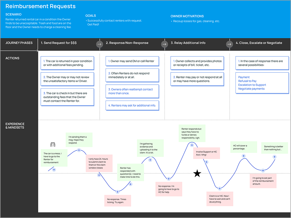
With the support of internal Subject Matter Experts which included a Product Owner and Owner Representatives, we began to survey and interview both Person-to-Person (P2P) Owners and Fleet Managers. Our early research and analysis was primarily concerned with understanding the current journey and workflow involved when they attempted to collect reimbursements from Renters.
The discovery phase included documentation of the current workflow, identification of the many pain points encountered in receiving payment, and specific challenges in managing requests and tracking statuses.
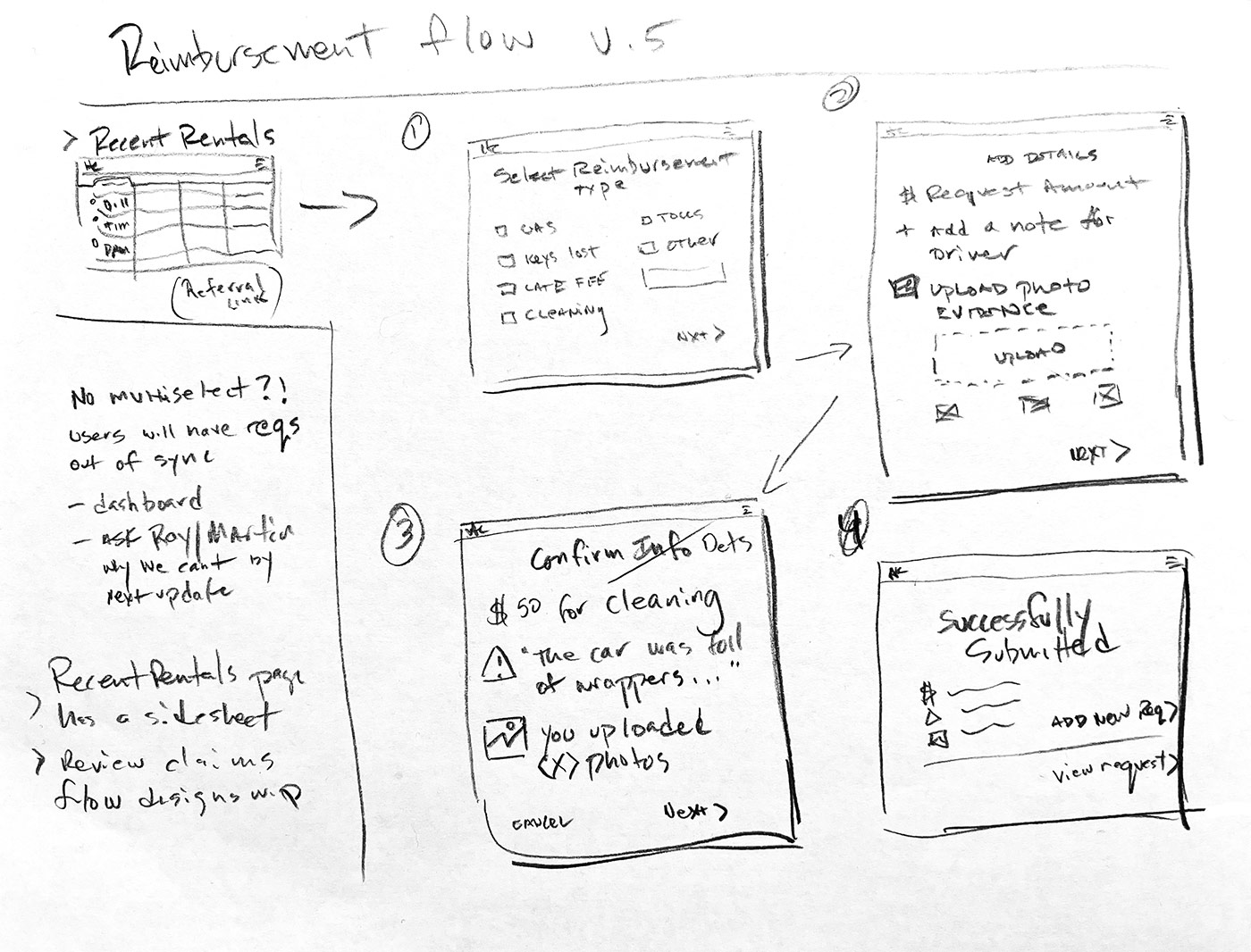
We quickly mapped our core workflow to begin visualizing our solution. There were other possibilities for achieving the same output but we had a precedent for our new feature which relied on the existing insurance claim submission experience. Beyond the reimbursement type selection screen designs would diverge but conceptually, the two were almost too similar requiring a deeper look into the terminology and presentation for these two distinct scenarios.
Interviews with P2P Owners and a Fleet Manager by the Name of Karen U. assisted directly in the development of this feature which was completed by end of April. With problem statements completed we developed a number of hypothesis about how to collect the reimbursement info, manage the requests through the lifecycle, and ensure that all the parties received the necessary notifications in a timely manner.
5. DISCOVERY & KEY INSIGHTS
Once a happy path was agreed on, we began demonstrating the workflow to Karen U. and a handfull of P2P Owners. Identifying the 24 hour submission window as a major pain point was a key insight. Owners didn't have just a challenge with managing the status for every request, they struggled to provide the neccessary evidence within the time frame available to them. A revised user journey and mid-fidelity wireframes for that flow were prepared for subsequent user testing.
A late version of the intake screen showing statuses for each reimbursement type appears below. It meet expectations for usability in testing which is to say, it completely failed. That failure appears below
The 24 hour window for submission was a business rule could not be changed but it could be worked around and the way to do that was by adding a drafting state. In consideration of Owners who might not be able to immediately or easily provide the photo evidence required to complete the request, we could instead offer them a additional grace period of up to 36 hours by saving a draft. This also added some new complexity to the workflow. Displaying statuses so that drafts could be easily resumed or just monitored was a new and formidable challenge.
The solution we arrived at, very much as a result of collaboration with our Owners, was primarily reliant on a dashboard type view tracking the status of each request. There was some compromise in envisioning this solution because our Owner segments had slightly differing requirements - some needed a scalable view for multiples while most P2P Owners only needed to track a single vehcle.
While P2P Owners had many concerns which were shared by our Fleet Owners, there was one specific recommendation of Fleet Owners which was to provide flexibility with the 24 hour submission request window. This rule was especially challenging for Owners of multiple vehicles and in particular our Fleet Managers who might have dozens of cars coming in and going out at any given time. The problem specifically was in providing full documentation for each request. Evidence collection could take some time to gather and upload. These items might consist of photos, receipts, or copies of a ticket for example.
Our hypothesis was the introduction of draft functionality would solve the 24 hour window reimbursement submission problem.
6 .SOLVING STATUS & DRAFT
Saving an incomplete request or drafting was the preferred solution we chose to give the requestor extra time to gather or take photos, collect receipts, and so on. It created new conditions in the workflow, most notably a view for managing them and for a more complete solution a notification system to prompt them in timely completion. The other options considered were allowing photos to be uploaded after request submission and requiring Renters to submit photos with the vehicle return. Neither of these solutions were considered viable for version 1 and we set to define the specifics of how drafting should work.
The "Save Draft" function allowed Owners to extend the window for their request up to 72 hours in certain cases but for most, the extension amounted to an additional 36 hours.
The decision to include drafts came somewhat later in the definition phase. Because we anticipated significant reliance on development, wireframes of the work flow had been produced to help gauge scope. Early ideation had already started being designed out when the draft function was decided on.
The introduction of drafts created a new layer of complexity because each request could have their own unique timelines per request type.
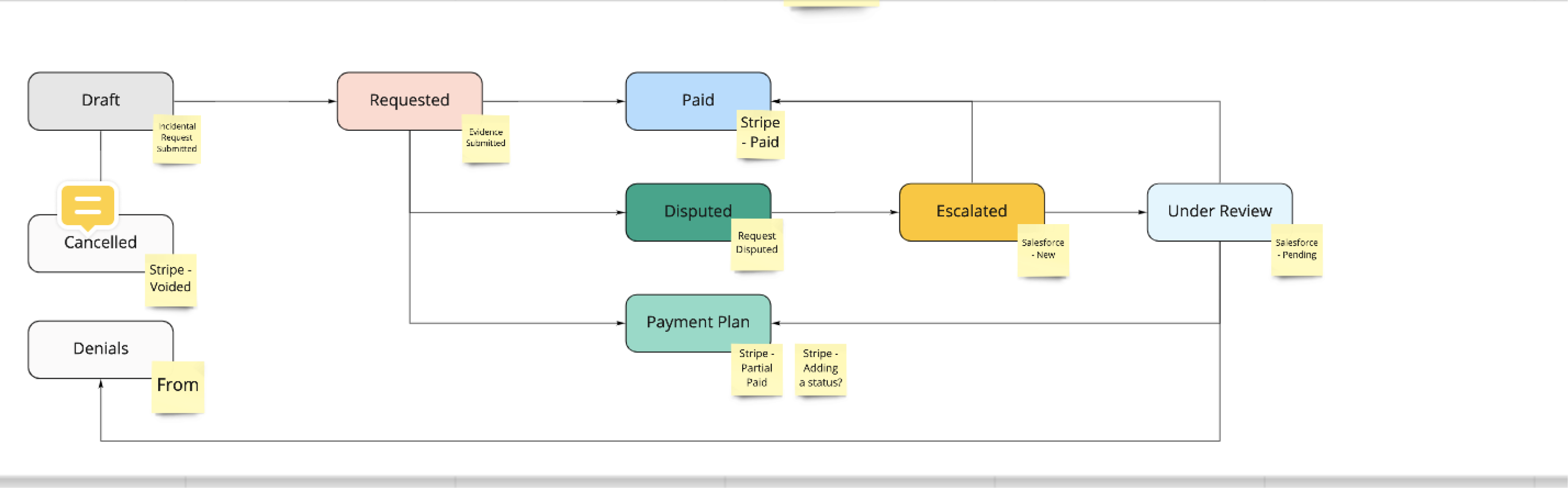
With draft functionality now included our new set of statuses grew quite a bit:
- Submitted
- Paid
- Escalated
- Resolved/Closed
- Expired (draft or original request)
The original request from stakeholders was to display the new statuses within the existing landing page UI. Below is a mid-fidelity wireframe of what the landing page looked like before the inclusion of drafts.
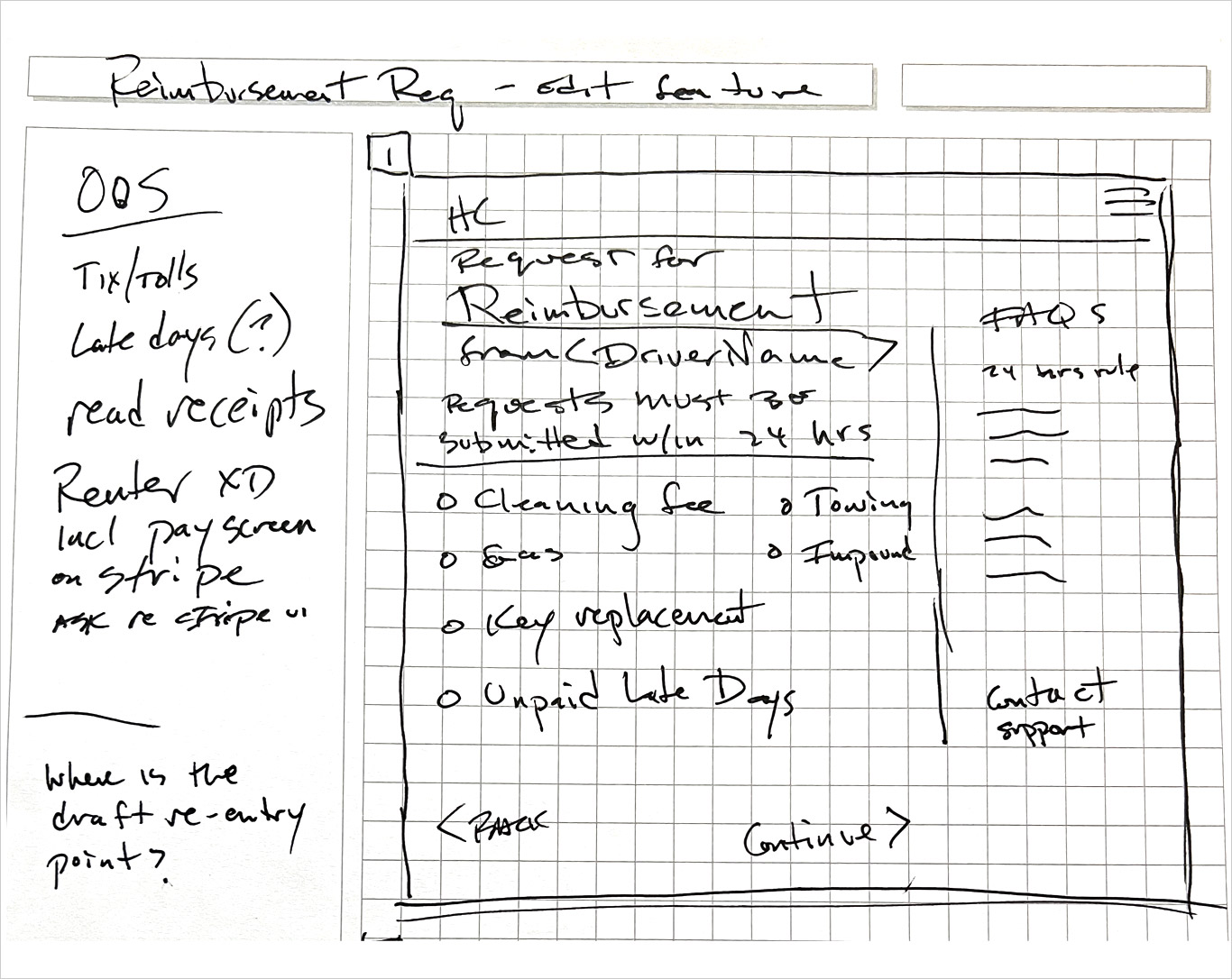
It's a funnel entry page type which was part of our design system. There is room to include additional request types in case we decided to do that so the design is scalable. It's a solid solution to helping Owners perform one tast - selecting what is called a 'Request Type'. Unfortunately, because of drafts it would be asked to do much more than originally intended.
The next iteration of the funnel entry page that was tested included draft status. It became clear quickly that this solution would be heavy on compromise and heavier on cognitive load. Even though the mockup below represents a worse case scenario it was not a scenario I ever would recommend in the best case. There were also technical concerns about the conditional two column format (the additional column was only required when there was a status to display, otherwise it served no purpose).
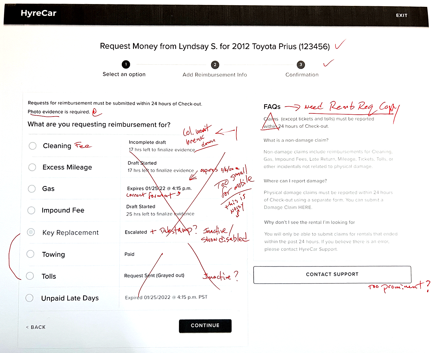
A quick test of the selection screen made it clear we hadn't found a satisfactory solution to displaying status for individual requests. The information was too important to get lost in a middle column, the available space too restrictive, and most importantly, the responsive breakdown would potentially create a page length which was problematic on mobile.
The solution (shown below) was suggested by our Fleet Manager Karen who suggested displaying status somewhere else entirely. Early on in the flow was a table which spawned a side sheet for each rental. We already had a dedicated space for rental details, the UI just had to be updated with the new reimbursement info.
An unexpected outcome was that the drafting function was not utilized as much as we'd hoped in the first 60 days. We surveyed a group of fleet managers and representatives to find out if this was an awareness problem or something else we hadn't anticipated.
The responses we received reinforced one hypothesis which was that users simply weren't aware of what the feature offered in terms of deadline extension. In short, a draft didn't fit with their mental model as something that would give them extra time to gather evidence. They thought of it more as a specific function that allowed them to save comments and return to them later. We're currently working to improve the messaging regarding drafts and to better communicate the benefits.
7. DESIGN SOLUTIONS
Lastly, you may have noticed I haven't mentioned the Renter (driver) facing solution. That's because that solution was determined to be out of scope for the first iteration.