The brief
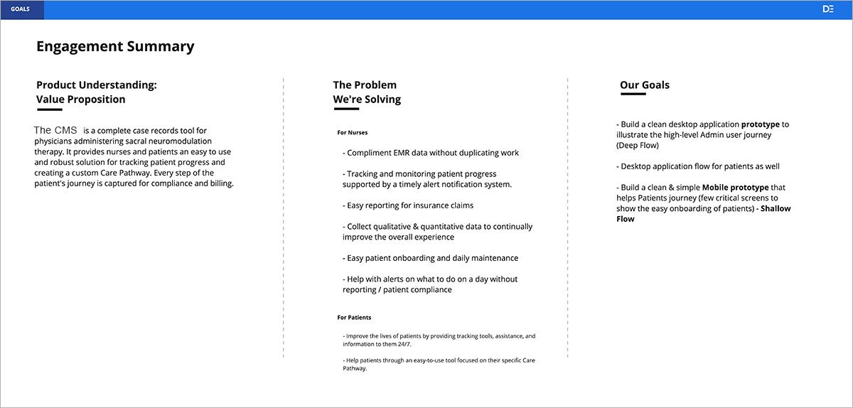
The product: a CMS supporting nurse administrators and patients through the full journey of a medical implant — identifying candidates, conducting tests, and ultimately receiving permanent implants. Our deliverable was an MVP prototype demonstrating the platform's core functionality for the nurse-admin side. (The patient-facing product isn't covered in this study.)
Constraints were severe by design: a two-week time box, no opportunity for user testing before delivery, and a clinical domain none of us had worked in. We split the engagement into one week of discovery and one week of UI design and prototyping, applying Lean UX principles throughout.
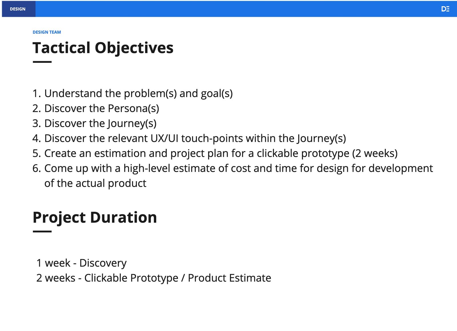
Week one: learn the domain fast
Our client was also our best resource: a medical practitioner who had brought device solutions to market before, serving as primary subject-matter expert. We structured discovery around client interviews, SME input, and competitive analysis, with several progress meetings to keep refining tactical objectives.
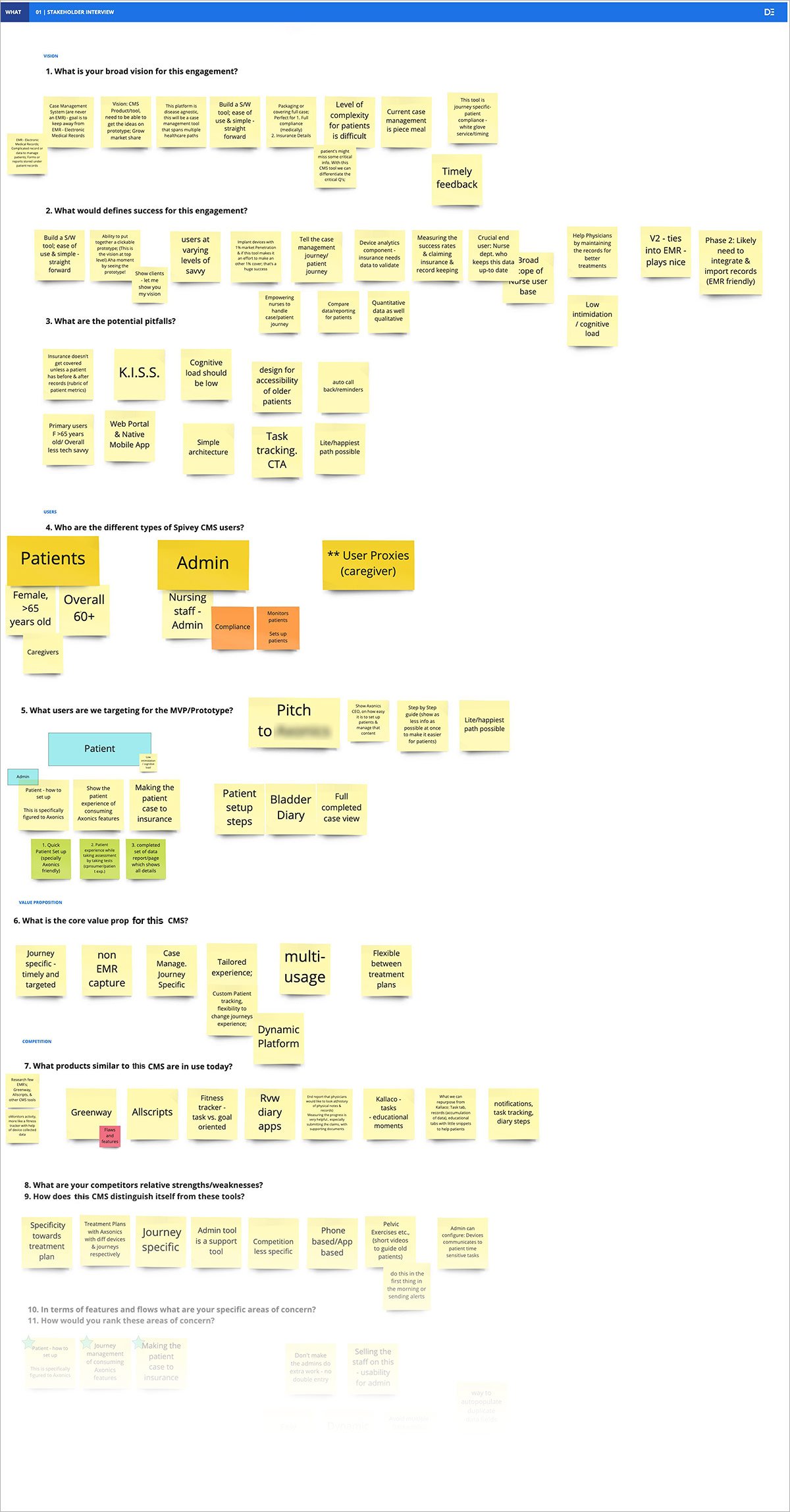
From jobs-to-be-done analysis we developed personas for Nurse Admins and patients, then validated and adjusted our assumptions through interviews with physicians familiar with the implant procedure. Because we'd done the domain homework first, those conversations could go straight to specifics: the lived experience of nurses and the needs of third parties.
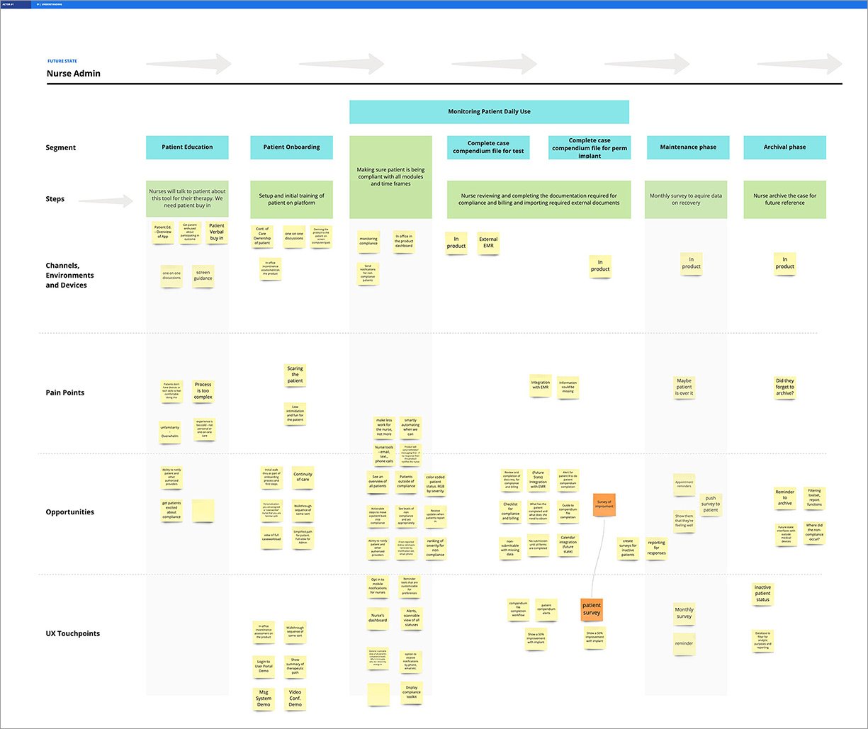
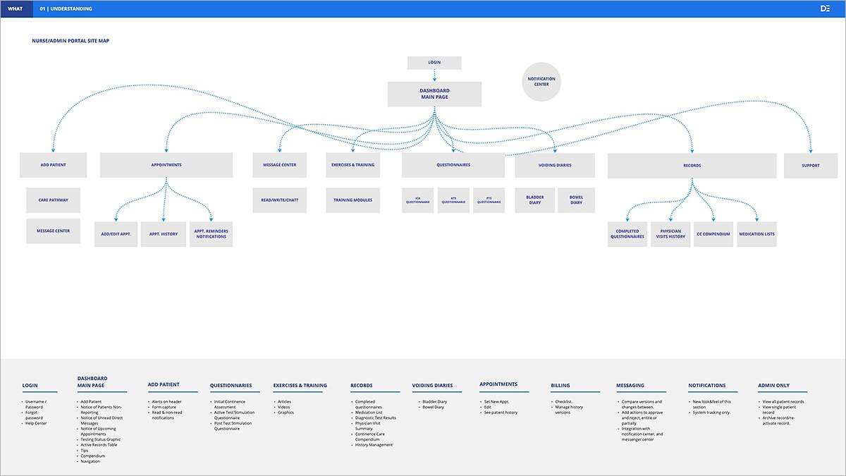
Architecture that earned its hierarchy
Initial top-level navigation gave each data point from the user journey its own category. Later interviews challenged that, and we reclassified sections by their relationships — Exercises & Training, Questionnaires, and Voiding Diaries all consolidated under a single Patient Records category.
The curveball: patient transfers
The first client design review surfaced two things at once: a new feature requiring architectural adjustments, and a warning about functional overlap with systems already in nurses' workflows — overlap we wanted to avoid wherever possible.
The new feature was significant. The original workflow assumed patients arrived through the implanting physician — but referring doctors (an OB-GYN, for example) can't perform the implant themselves. Patients needed to transfer seamlessly in and out between practices, which meant rethinking our entire flagging system late in the sprint.
Delivery
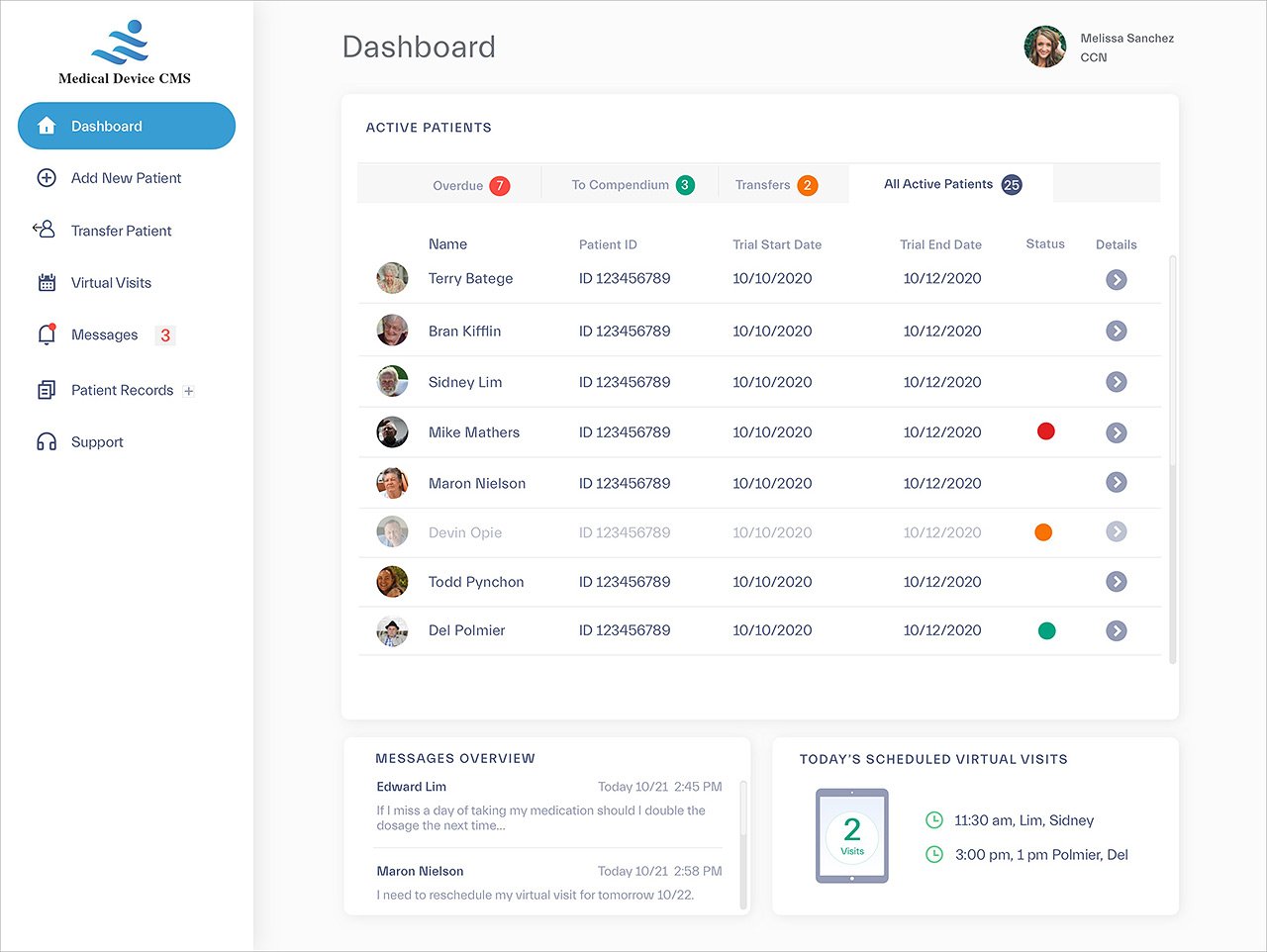
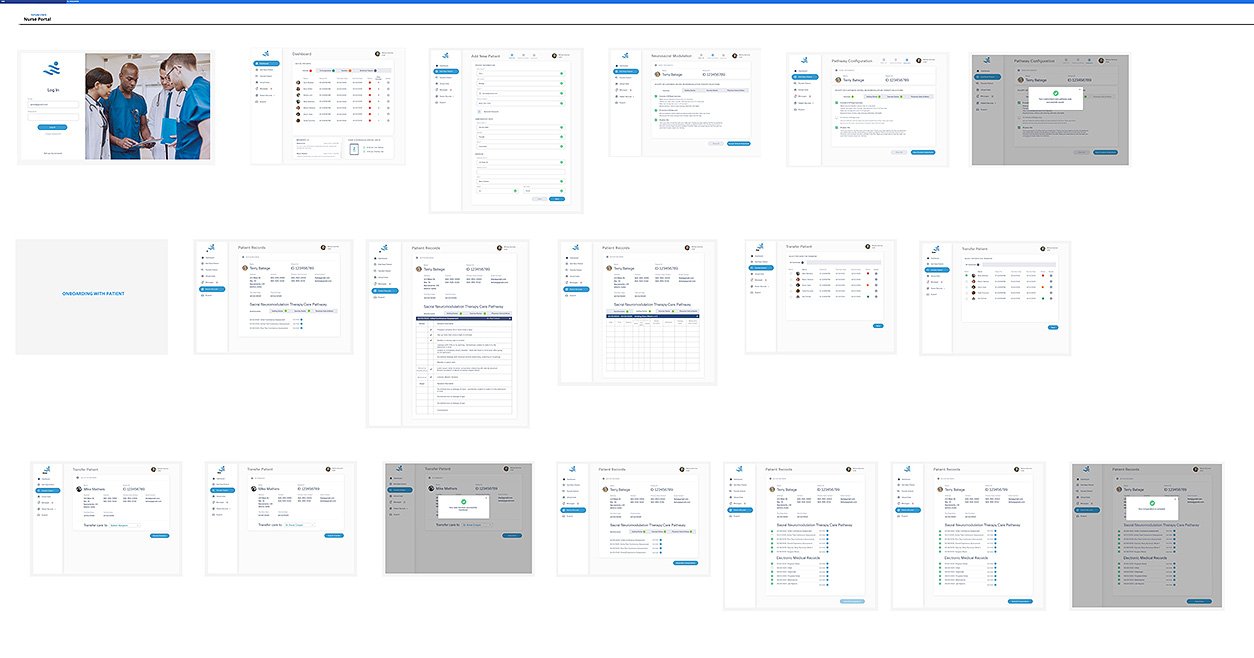
The final prototype comprised 18 screens covering the critical flows: add new patient, transfer patient, and create case compendium.
The client was extremely happy with the sprint's outcome and moved on to refining the patient-facing solution ahead of seeking funding. DePalma Studios adopted the design system we created as a potential baseline for future CMS engagements.